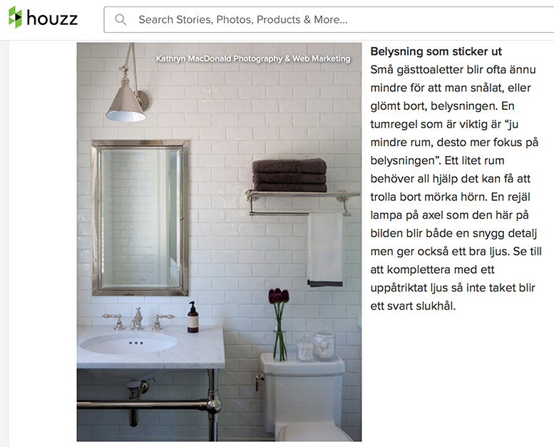
Excited to have one of my bathroom shots features in a Swedish Houzz article. Take a look! It is in good company with other very lovely bathrooms. Also my San Francisco colleague Michele Lee Wilson has a featured photo as well. Fun!
Tips, advice, insights & thoughts on interiors photography, portrait photography, web marketing, and SEO.

Excited to have one of my bathroom shots features in a Swedish Houzz article. Take a look! It is in good company with other very lovely bathrooms. Also my San Francisco colleague Michele Lee Wilson has a featured photo as well. Fun!
It has been a great week marketing wise with 2 features on Houzz, the interior design and construction website and blog. Just learned this morning that a project I shot for interior designer Kathy Farley of Art Decor is featured as the Room of the Day with a detailed story about her design process for this classic Berkeley craftsman home by architect Henry Gutterson.
Read the full story on Houzz!

A snippet of the feature story about this Henry gutterson architectural gem in the berkeley hills.
The 2nd feature, earlier this week, was a dressing room that I shot for Marie Christine Design that was featured in a post about dream dressing rooms on the French version of Houzz.

One of the dream dressing rooms featured on French Houzz.
Thanks so much Houzz for the wonderful feature and article! I am honored.

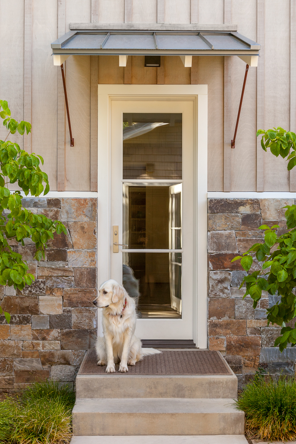
Starry in her Atherton garden at the backdoor. - Arterra Landscape architecture
There is a Japanese design concept / aesthetic called wabi-sabi. Loosely defined, wabi-sabi represents the acceptance of transience and the beauty of imperfection. When I approach an interiors photography shoot, I look to convey that transience into the beauty of the room design. It can be subtly conveyed in a creased pillow, an indentation in a chair, running water, an open door, or an animal wandering in or out. Adding this playfulness or spontaneity lends an intimacy and everyday realness to the images.
On some shoots we get lucky. There might be a personable and cooperative pet who keeps us company as we shoot - following us from room to room. Some are even posers, in the very best sense of the word. They act as the transience I am looking for, adding charm, humor, personality and approachability.

Louie the Frenchie in the master bedroom. - Fannie Allen Design
The character above is Louie. Though a senior citizen with a propensity for wandering out the front door on a moments notice, he quickly won over the whole crew at a recent shoot with designer Fannie Allen at this colorful Menlo Park residence. He patiently cooperated, turning his head this way and that for the perfect profile and mood. Of course a cookie was not too far out of range.
As you can see he adds a breezy spark to an already cheery, sophisticated room.
Adding animals, and other wabi-sabi elements, adds a sense of unpredictability and intimacy that elevates the images. Give it a try!

The family cat in the media room. - Kendall Wilkinson Design

Lucy entering the kitchen from the backyard garden. - Megan Warren Interior Design
I am excited to announce the launch of my newsletter. I know, I know... I have been meaning to do this for awhile. The feedback has been overwhelmingly positive.
On my photo shoots, I see many beautiful interiors and decided you might be interested in seeing them as well. There is so much design talent in the San Francisco Bay Area and I have the good fortune of working with really talented designers, photographing their work for their websites, publications, contest entries and editorial stories.
For my July 2015 issue, I featured a project shot for MacRostie Winery of their new estate house in Sonoma. The interiors are by San Francisco designer Grant K. Gibson. I am thrilled to share it with you here.

MacRostie Winery's new estate house tasting room is surrounded by spectacular views of the vineyard.
In late winter I photographed the amazing new estate house at MacRostie Winery. While the winery has been around since 1987, they had not had a tasting room - until now.
The estate house is 10 minutes outside of Healdsburg on Westside Road. Situated on a hill that overlooks the vineyard, there are dramatic views in every direction. We were fortunate to first arrive in the evening just after a rain, making for the most spectacular sky.

The artwork in the MacRostie Winery estate house tasting room appear almost to be additional windows.
The interiors are by San Francisco designer Grant K Gibson. He describes his goals, inspirations and selections: "I wanted to warm up the modern space by using soft colors like greens and pale lavenders, as well as pull in outside colors, and from the vines.
For the artwork selected - I wanted to almost make them seem like windows.
Overall, my goal was to make the space feel as if you were coming into someone's private home - make the space like a living room or dining room that is inviting, warm and comfortable with layers and textures."

MacRostie Winery's estate house tasting room features high ceilings and a large expanse of windows letting in streaming sunlight.
To view additional images from this lovely project, visit my website at www.macdonaldphoto.com or check out how the images were realized on the MacRostie Winery website.
Please feel free to give me a call at 1-415-640-7506 for information on how I approach a photography project and rates.

The custom-made communal table invites conversation while wine tasting and noshing.