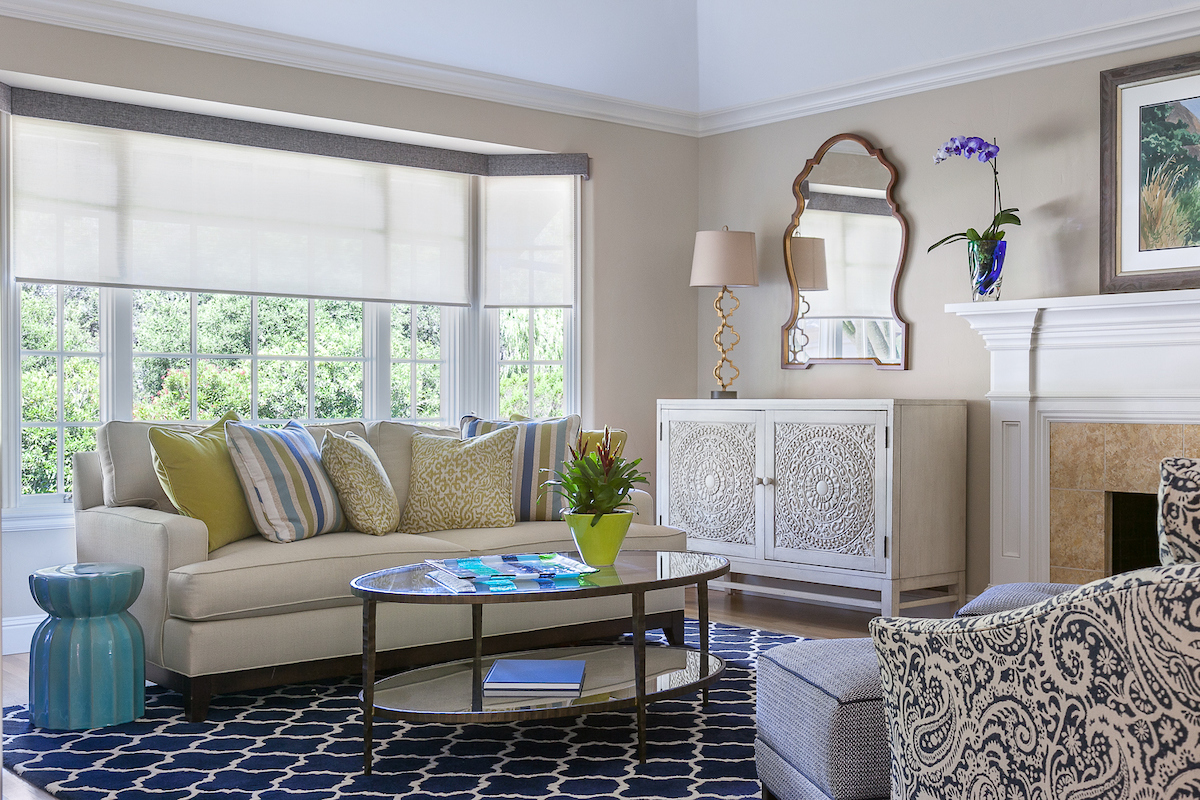
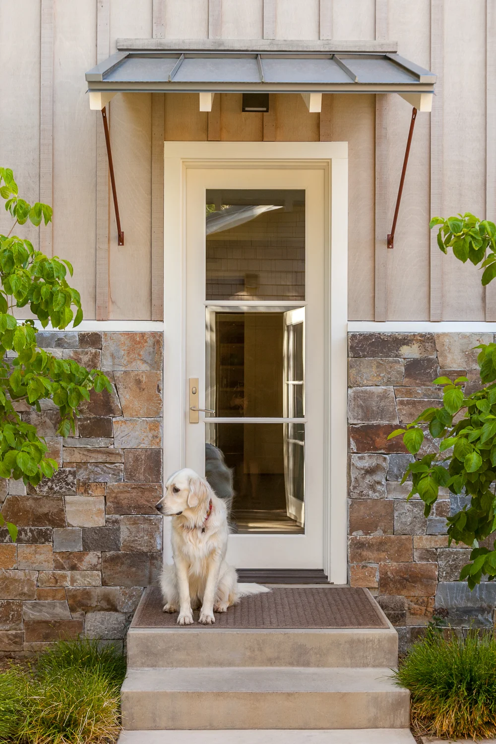
Design by Price Style and Design
Design mock-ups present something of a challenge to creatives working in the fields of architecture and interior design. It’s not always practical—or within budgetary considerations—to create a three-dimensional model for every project an architect or designer undertakes. Apart from often being expensive, models are frequently burdensome to transport, especially on site. And sometimes models just don’t do the job for customers who need a little more meat to visualize an end product. By the same token, interior designers might present raw source materials such as swatches of fabric and carpet and samples of tiles, but this might not effectively persuade clients that they have a firm grasp of the concept behind the design.
Translating three-dimensional design work into the constraints of a single dimension equally poses a challenge to those who take space as their raw material. More often than not, such work looses some of its luster when presented within the bounds of a flat surface. But this doesn’t have to be the case. Whether you are working with new design proposals, or showcasing past projects you’ve completed, new technologies, coupled with top-notch, professional photography will bring your work to life.
Most clients will be able to grasp a design concept best through photography. But casual snapshots don’t cut it. Not only will amateur snapshots relay a message of unprofessionalism to your clients, they will also be detrimental to the design work itself. One of the interior designers I’ve worked with regularly brought me in to photograph the work he had recently done on a commercial space. The business owner (his client) had another photographer photograph the interiors to be used for their brochure and website. When the interior designer saw the poor quality of the photos taken he declined to include them in his portfolio, yet he really wanted to be able to showcase this project on his website portfolio. His discerning eye could tell where the lighting was off and where shadows were cast on details that he wanted to highlight. The colors were faded and didn’t accurately convey the color palette he had chosen to use within the interiors. Moral of the story? It’s well worth the investment to scout out an experienced photographer who is willing to really collaborate with you to achieve stellar images of your work to showcase in your portfolio.
Equally important is the manner in which the lens captures the three-dimensionality of the design and the ways in which they render spaces that are meant to be lived in. A good photographer can achieve this with lighting and composition; both are essential factors when presenting your design work in a photographic image. New technologies, such as advanced 3-D graphics and rendering solutions, can render tangible spaces that have multiple layers of dimensionality in a flat image. Similarly, 360-degree photographic views of interiors and virtual reality approaches to design can have equal impact. Often, a combination of stellar photography, mingled with a few advanced 3-D rendering solutions, is what will best impress today’s client.
Want to get that “WOW!” factor?
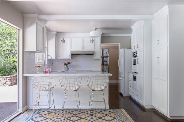
So, you’ve found a photographer who is eager to really collaborate with you. What are some of the options you have for showcasing your work through photography? As a rule of thumb, Before-and-After shots are a fantastic way to show prospective clients the high caliber of your work. You might be eager to show clients the end product, but comparative shots that tell the story of how you worked your magic are a highly effective way to let your client know what you’re capable of doing. Be sure your Before-and-After photographs are shot from the same angle so that the differences are immediately discernable. Take this Before-and-After of a recent kitchen remodeled by one of the interior designers with whom I work. It’s hard to believe it’s the same space! The photographs really do pack a punch in telling the story of the space’s transformation.
Before -- Design by Price Style and Design
After--Design by Price Style and Design
Another consideration, when shooting and selecting photographs of your design work for your portfolio, is the number of images to include. You want to show the breadth of your work, but you also don’t want to overwhelm clients. My advice? By all means be selective! Show only the very best of your work that you’ve created for high-profile clients. If using a physical format, show 20 different photographs that showcase the type of work for which you are being considered. If you submit your portfolio digitally, shoot for 30 photographs. It’s also a good idea to add narrative context to your photos. What was the problem you were asked to solve and how does your design solve the problem for example? Testimonials can equally bolster the images. It’s a way of garnering trust and investing meaning in the work that you do.
In a nutshell: your portfolio should tell a cohesive narrative about the kind of work you deliver. A combination of stellar photography, advanced visualization technologies, testimonials, and project anecdotes will help you do just that.
Need help with great photography that can showcase your design work? Check out our portfolio of interior design and architecture photography at www.macdonaldphoto.com.
